In June 2026, I ran a book cover contest on 99designs. It was an eye-opening experience, and I’m cataloguing my journey here for other debut authors debating whether this is the right avenue for them—or for any reader who is interested in the process of book cover design.
Putting your debut novel out into the world feels like a big deal, because it is. It’s the first (and sometimes last) tangible output that anyone and everyone can judge your writing by. What have you been doing, all this time that you say you’ve been “working on The Book”? Needless to say, the cover matters a great deal. Readers really do judge books by their covers.
99designs offers you a lot of options when it comes to pairing clients with designers. You can peruse their platform to find someone whose work you like, and invite them to a 1-on-1 project. Or, you can set up a contest that many designers will bid on. This gives you a wide variety of options, and it felt like the best course for me, after my first foray with 99designs fell flat (unfortunately I had to cancel my 1-on-1 project when the designer went MIA).
For my contest, I selected the Silver prize package (then worth $679 CAD), and was assured that I would receive at least 60 designs. I selected “Open” rather than “Blind”, so other designers could see each others’ work, and declined the costly add-ons to make the contest private or boost visibility.
What I sent the designers:
(short blurb)
Rumpelstiltskin meets Interstellar: a songwriter trades her fertility for a career among the stars. But what if her voice has more power than she knows, and Big Tech wants that, too?
(author's note)
The heroine of my story navigates the tension between a music career and motherhood; corporations and independence; science and faith. It merges speculative elements (science fiction & fantasy) with magical realism, allegory, and deeply personal stakes.
I also sent them the back cover blurb, which you can read here.
I specified NO AI, no on-the-nose musical notes, and no spaceships. YES to indigo/navy + gold accents.
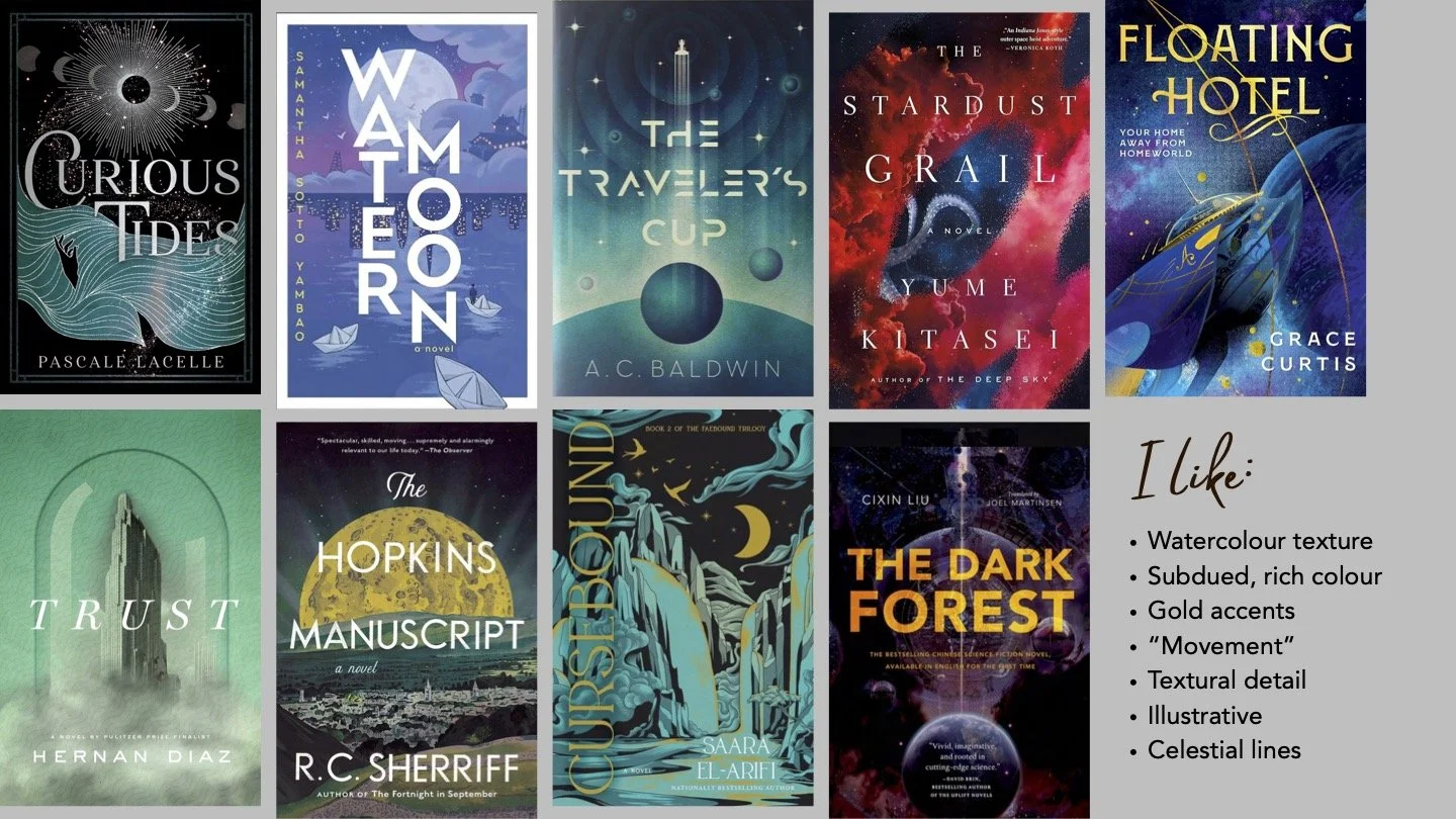
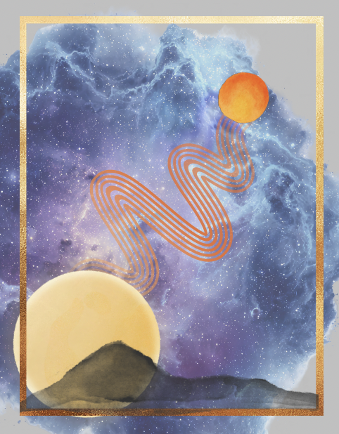
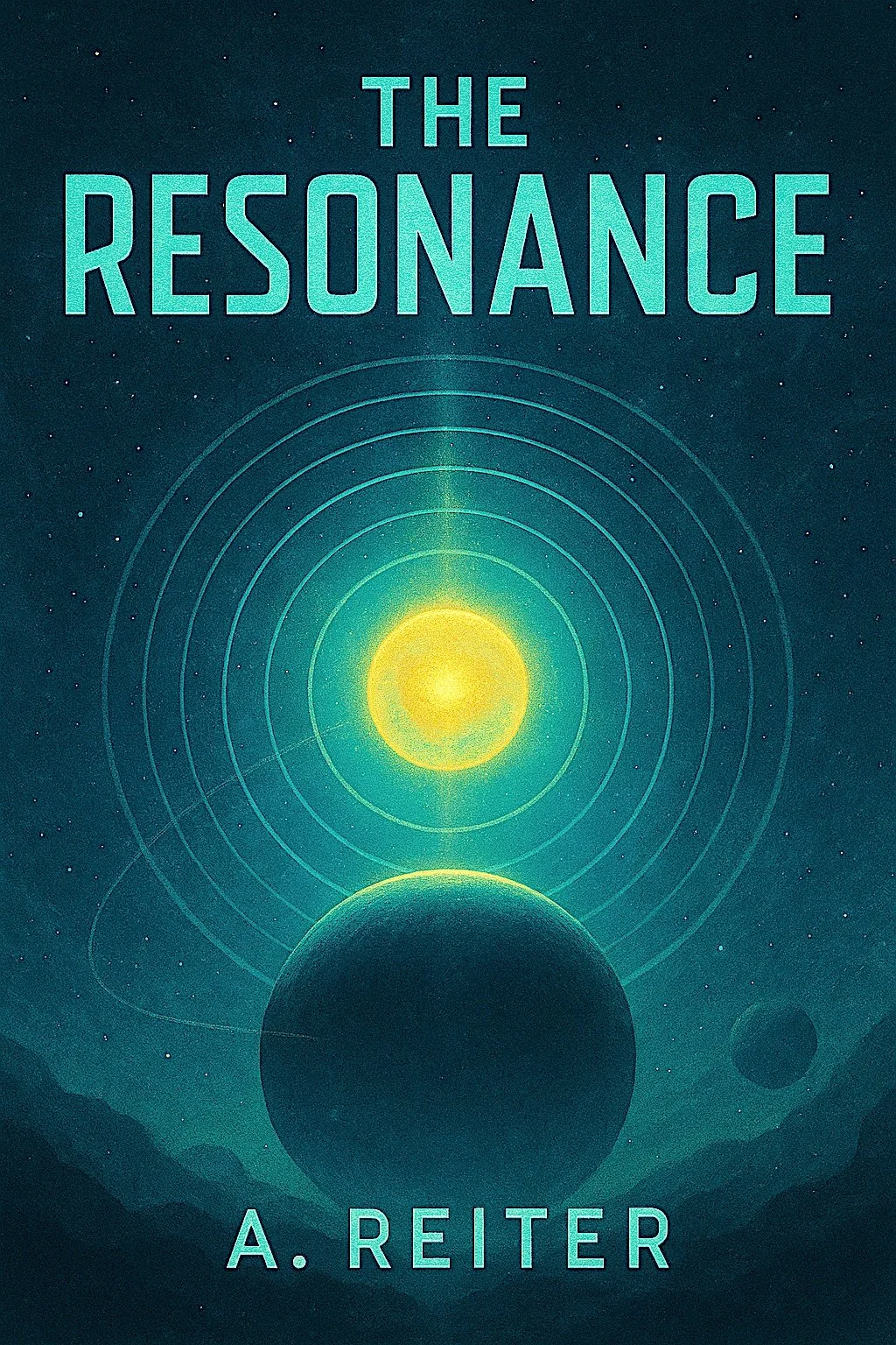
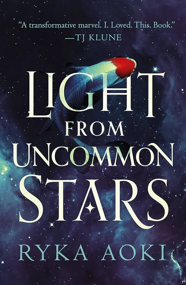
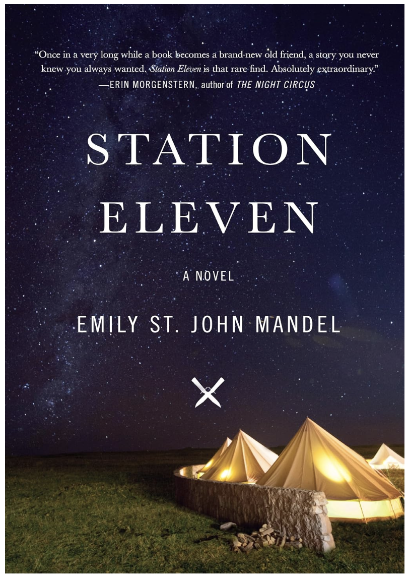
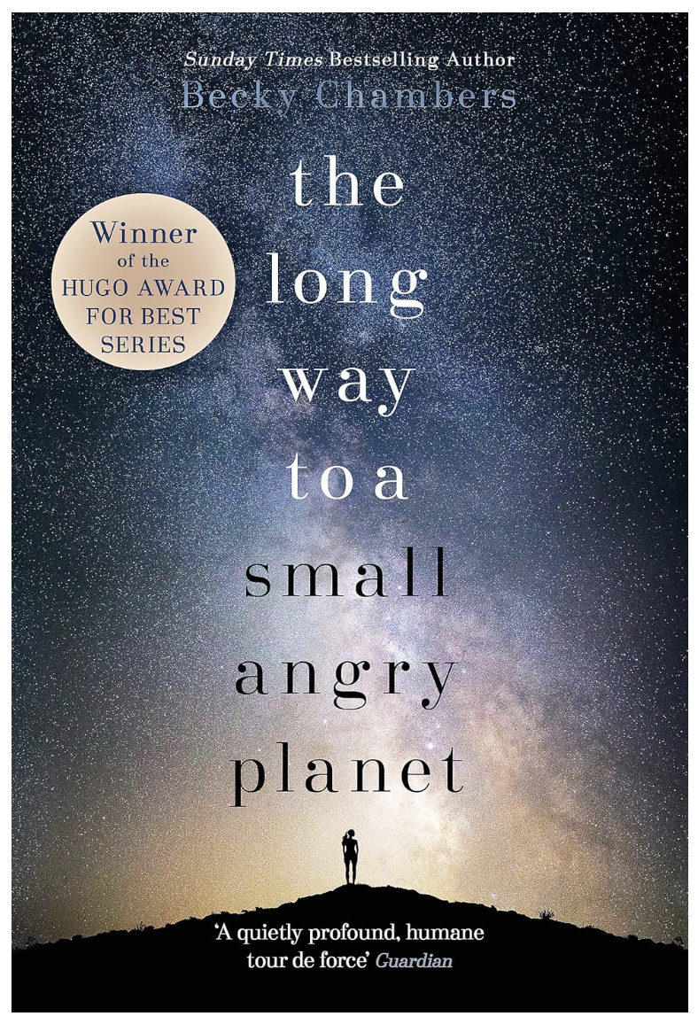
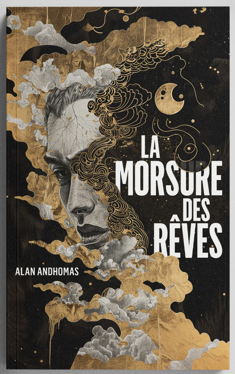
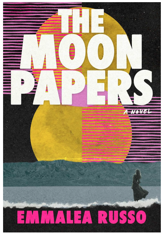
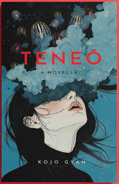
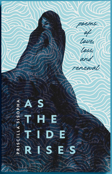
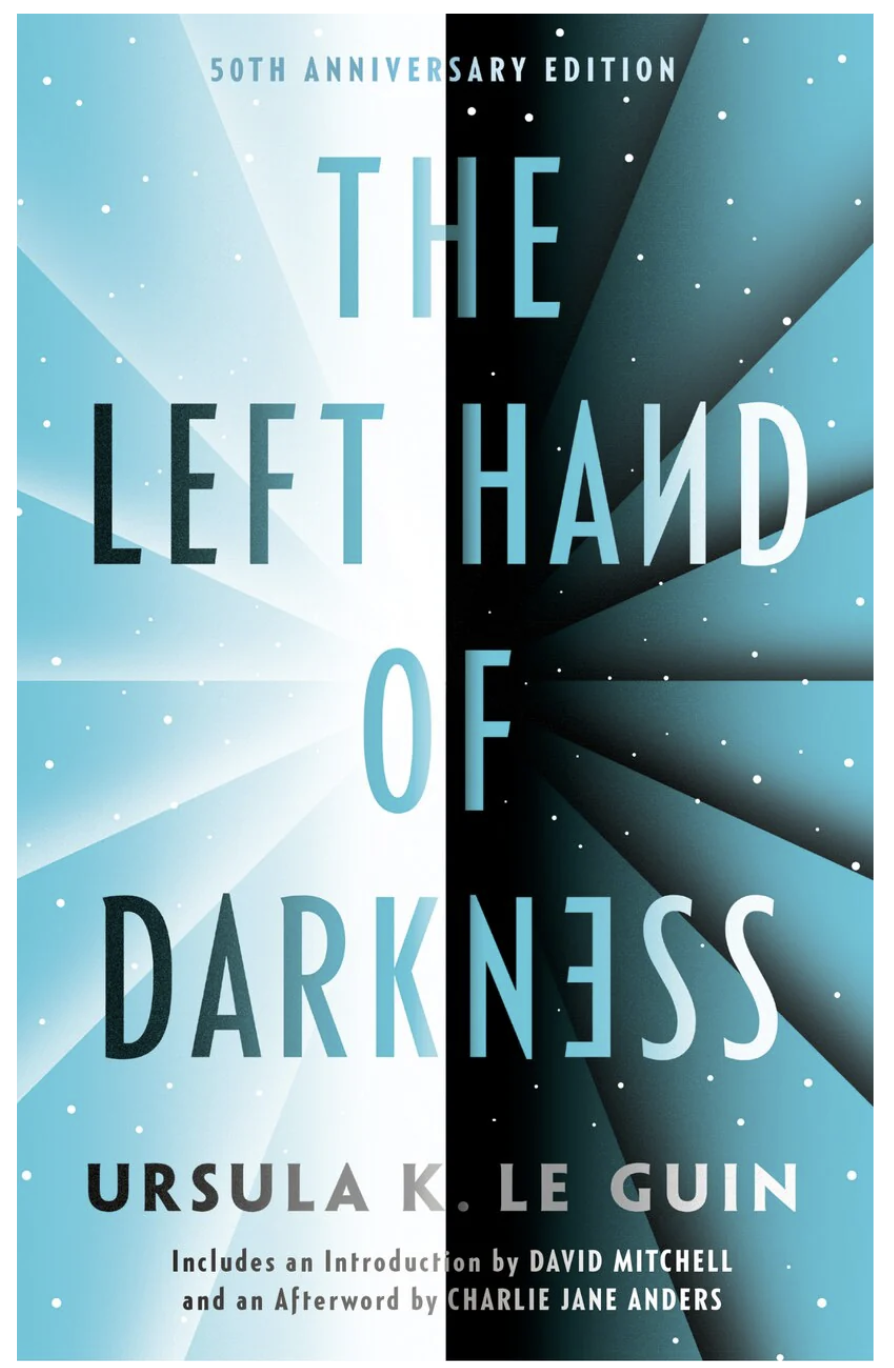
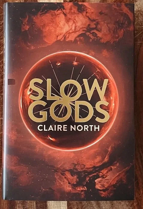
Above: inspirational covers. I wanted a rich, dark cosmic palette with gold accents.
Below: my personal mockups imagining two suns, with sound waves connecting them somehow.

Round One
The Qualifying Round was open for 4 days, and I was underwhelmed by the initial entries. The platform associate did warn me of this; less experienced designers tended to flood new projects with sub-par work. Other designs were thoughtful interpretations of the brief, but the overall composition or individual elements suggested the wrong genre; red font for horror, static for ‘80s grunge, photorealistic for contemporary romance—or even watercolour suns like an elementary school textbook.
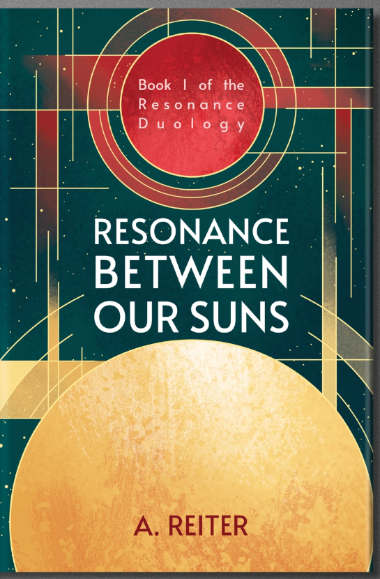
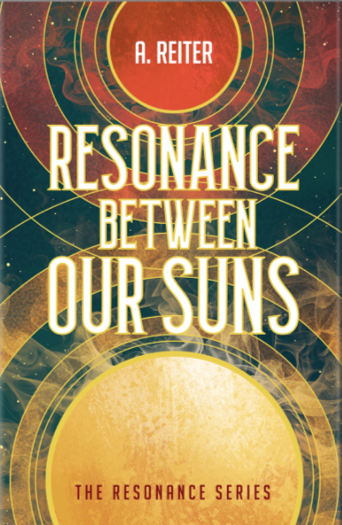
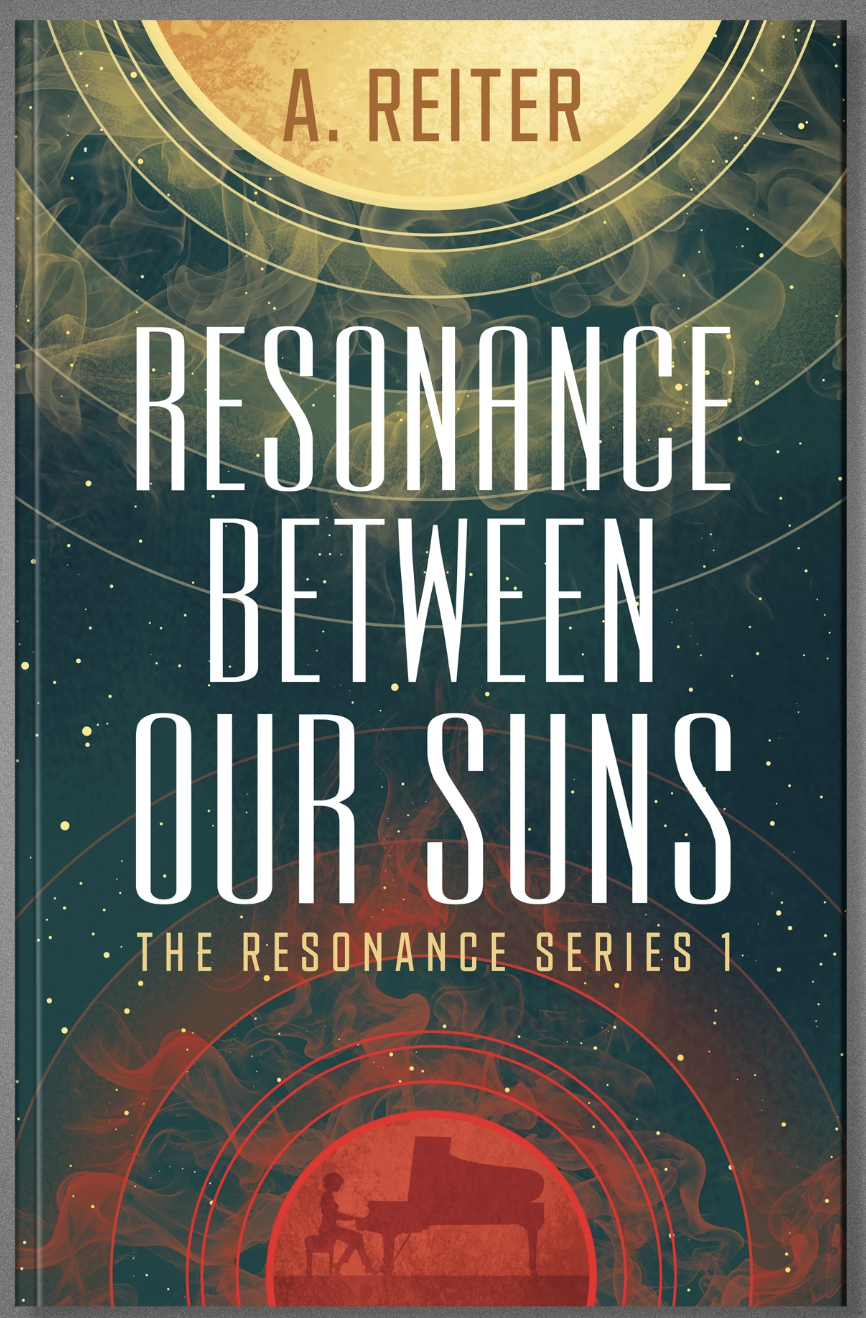
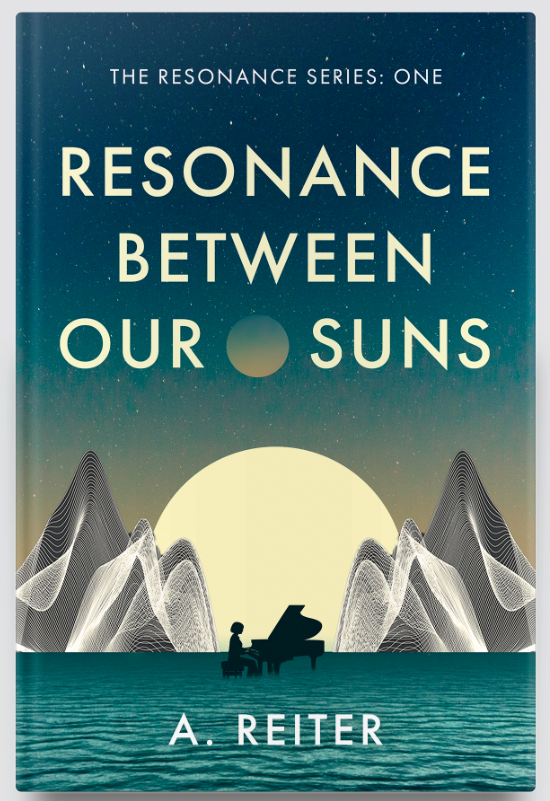
But, I waited until the 3rd day, and was rewarded by 2 designers who stood notably above the rest. The first, Designer A, had chosen a teal cosmos, with two bold suns in red and yellow. I really enjoyed his use of texture, and invited him to pursue the concept further. Below is a summary of his many patient iterations.
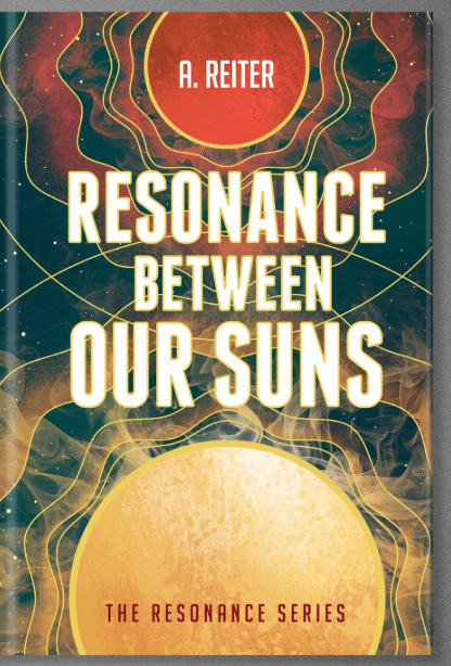
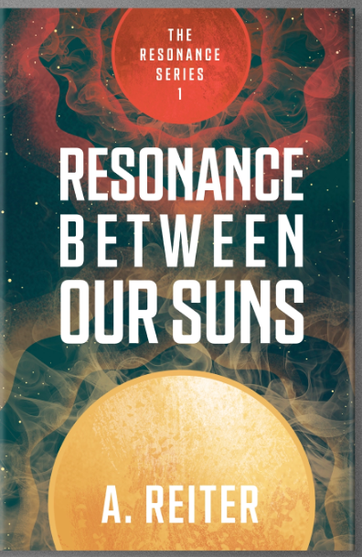
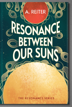
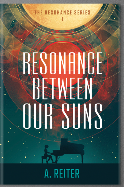
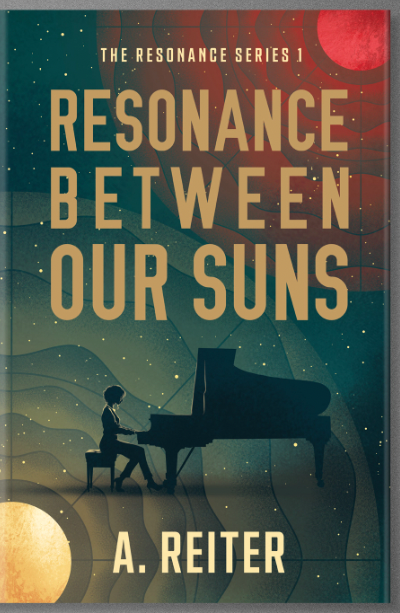
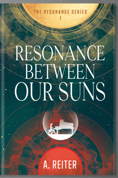
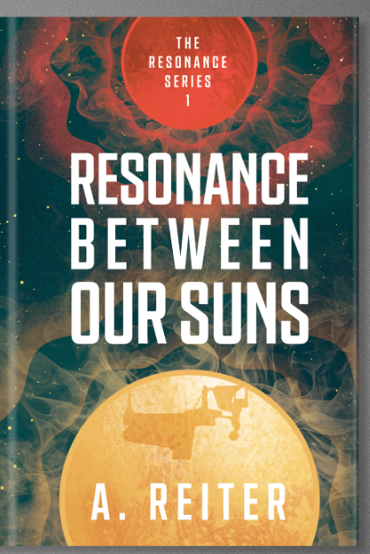
Designer B took me by surprise, too. He chose a softer gradient of plum to apricot, with an Ascot-ready female silhouette standing on a "sun". It wasn't in the brief, but he was the first to think of putting a person on the cover.
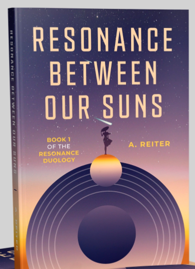
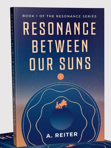
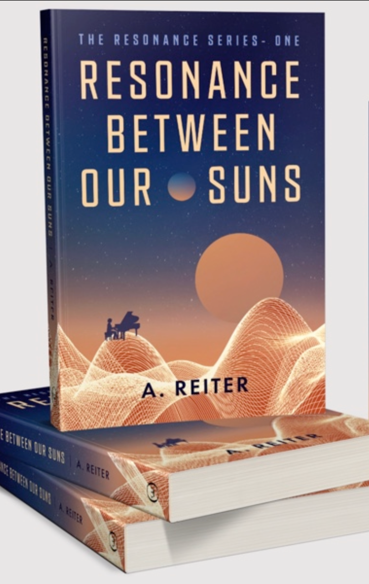
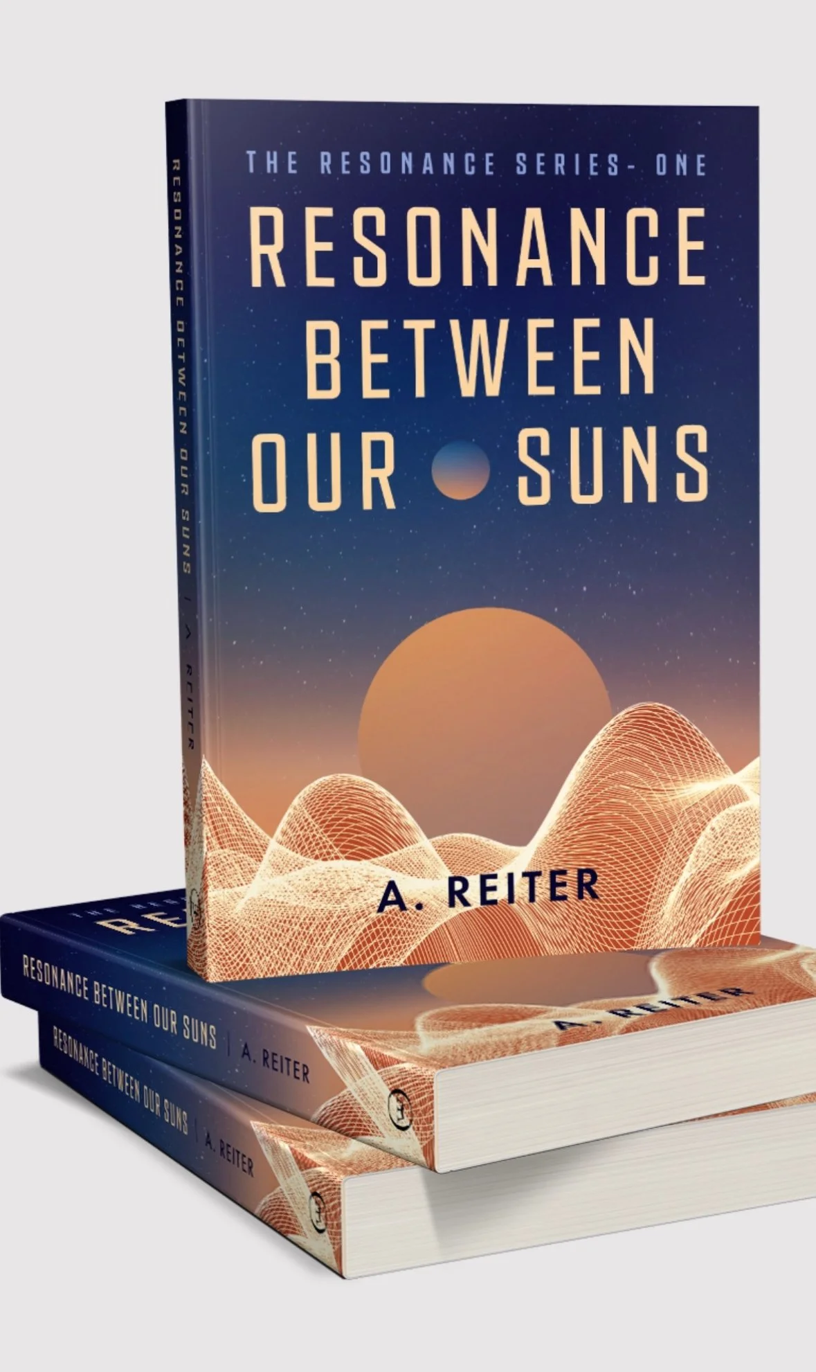
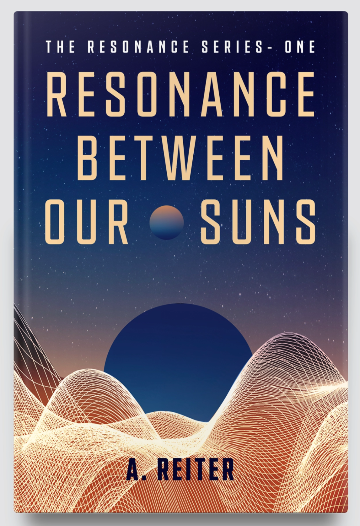
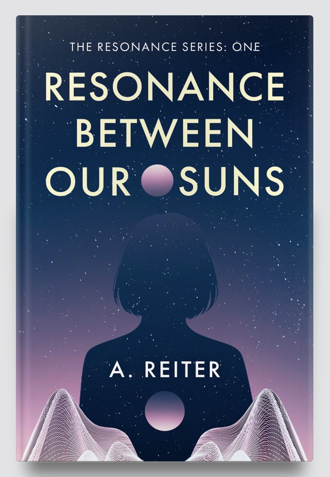
I'm not sure why I never considered it, but it was remarkable how much one small figure could evoke emotion amongst a larger landscape (see comparative designs below). In his later iterations, he reinterpreted the sound waves as the landscape, a concept I loved.
WHAT MY READERS THOUGHT:
I sent the results to my newsletter subscribers so they could vote on which concept they liked best. I only gave them two days until I had to confirm if I wanted to proceed with those designers—otherwise, it was back to the drawing board. 99designs gives you 4 days to decide who are your (up to 6) finalists. If I chose not to proceed to the final round, I could walk away and abandon the project, as I had chosen not to guarantee the prize.
Thank you to all who sent me their feedback! You made a difference in helping me gauge what was the right cover for my book. I was surprised—the results were split exactly down the middle. Half of those who replied liked Designer A's stronger design; the other half liked Designer B's softer palette. Most liked the idea of music/sound referenced in the image, but not necessarily as depicted in the submitted mockups. It was so interesting to read how each person connected to their favourite design.
However, even with the promising cover directions of these two designers, I felt like I had not fully realized the potential of a 99designs contest; while I had received a couple dozen designs, many of them were different version of the same weak concept; sometimes a designer would upload 5 variations of a cover I could have made in Canva. When I contacted the platform to discuss my options, they advised that I would have attracted more top designers if I had chosen to make my project “Blind”, because this prevents lower designers from pirating the unique concepts of others. 99designs graciously offered to extend my Qualifying Round a couple days, and changed my project to “Blind.” They also added, with no charge, their “Power Pack”, which boosted my project in front of more designers’ eyes.
I ended up calling 99designs a few times, not for the least of reasons being a designer who fed my author photo into generative AI and used that to propose a cover concept (off-putting, to say the least!). Each and every time, my call was answered promptly and with excellent customer service. They went above and beyond to ensure that I would be satisfied with my experience, and there really aren’t very many companies that do, these days.
In hindsight:
My Qualifying Round ended up being just under two weeks, with a couple stop-and-go moments, and while I did end up receiving over 100 cover submissions, they were only from 22 designers (many of those being revisions per our mid-contest conversations). 117 covers sound like a lot, but it's surprisingly easy to disqualify options. No to obvious AI use; no to hair on fire or planet eyes or lava, lightning, portals, or designs that relied solely on a single piece of non-copyrightable stock imagery.
There is a big difference between 60 designers and 60 designs; knowing what I do now, I would have probably guaranteed the contest from the beginning, and made it “Blind” from Day 1. That would have likely made a difference in the quality and quantity of submissions. But I was wary of guaranteeing—and in the end, it still was a success!
FINAL ROUND
There was something special about the entries from Designer A: Srdjan Vukovic / WolfBell. I could tell he had a strong command of Photoshop, and was tireless in re-interpreting the brief despite my sometimes contradictory feedback. As soon as he sent in a version with the red sun calmed down to copper, I knew we were getting somewhere good. Although I could have selected a couple other designers for the final round, spitballing their concepts and pushing them closer, I didn’t want to waste anyone’s time and believed that Srdjan could see me through to the end.
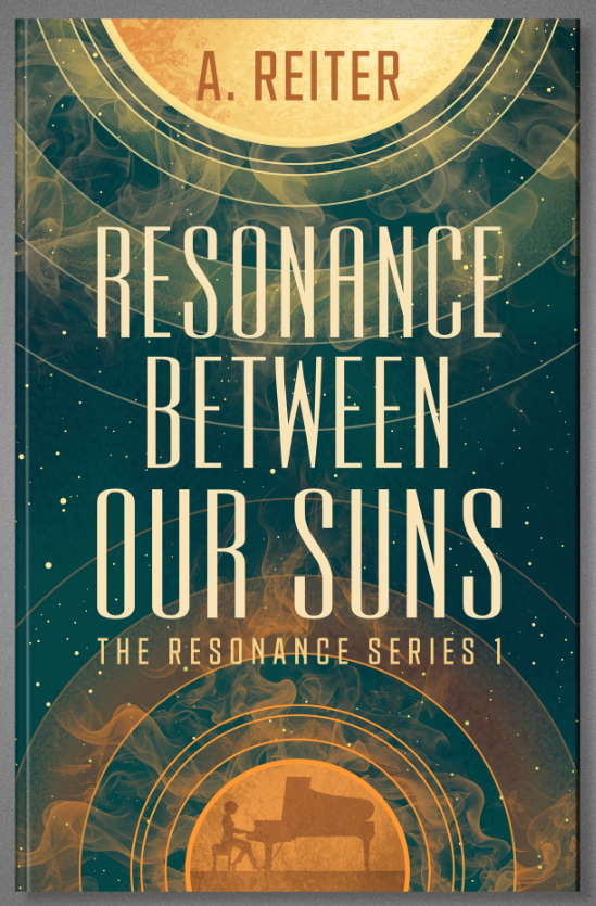
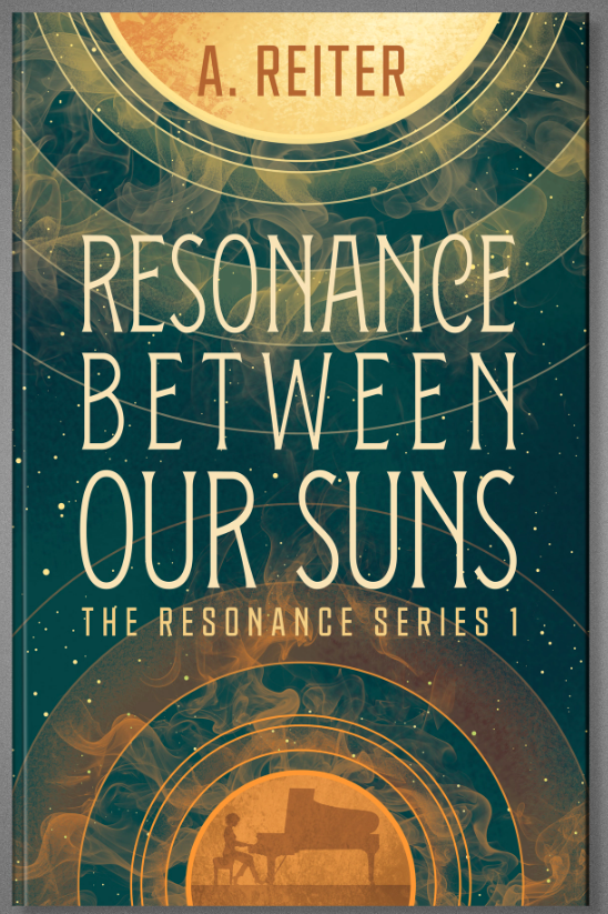
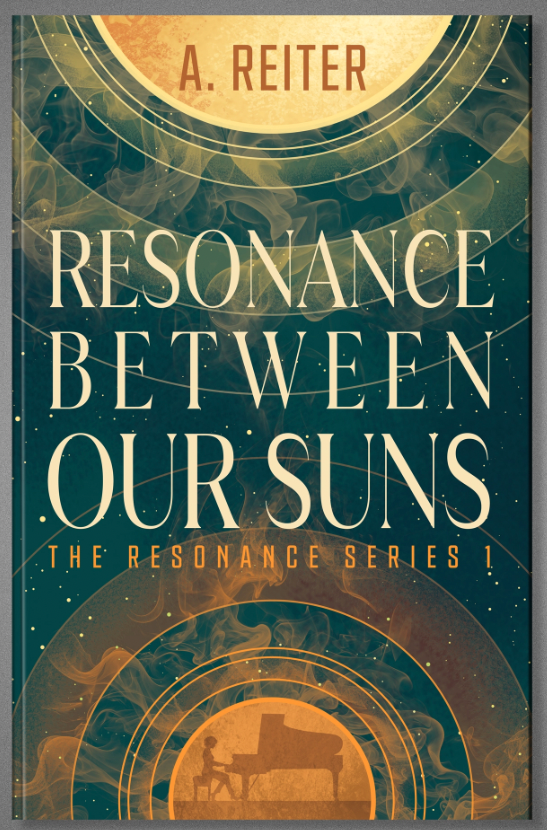
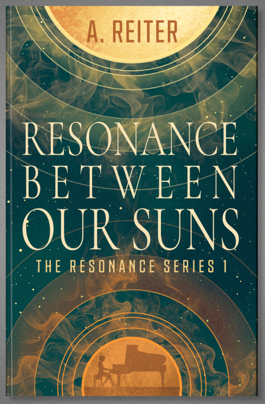
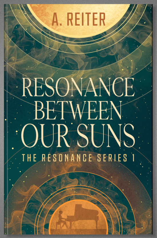
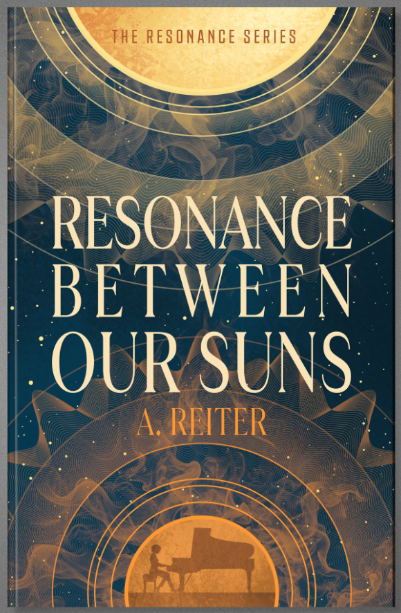
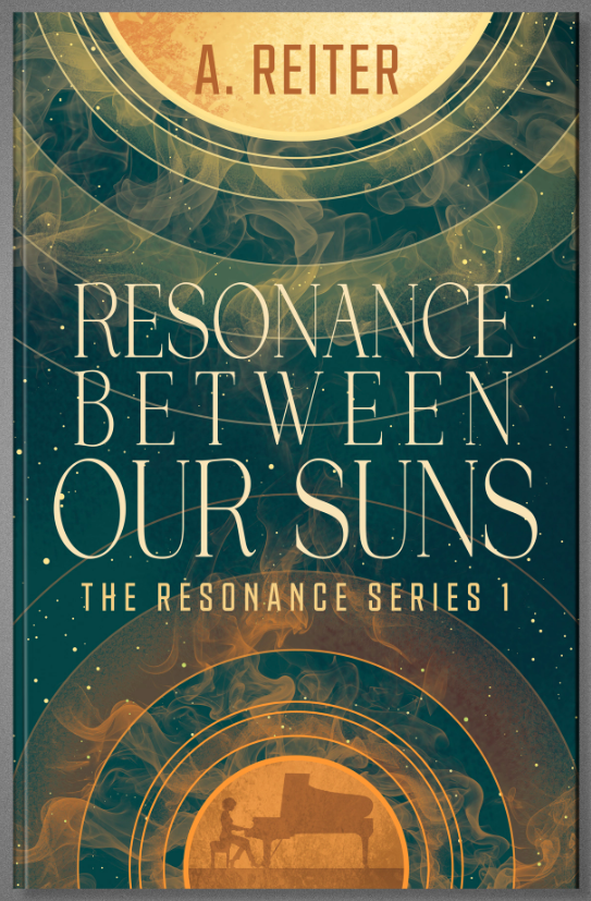
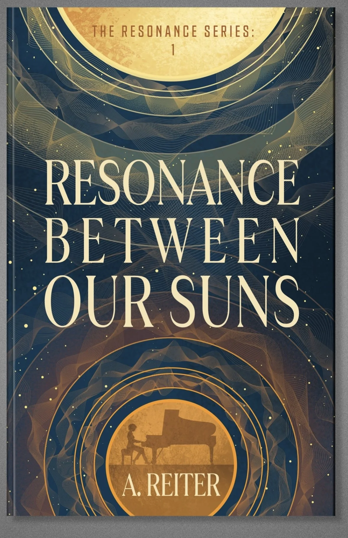
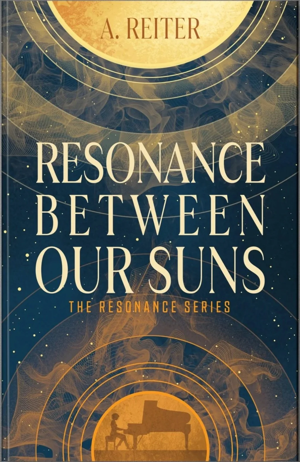
He was incredibly patient, giving me multiple layout options when I asked for alternative fonts, different text hierarchy, “sound wave” treatments, and even indulged me in a more navy background sample. Some of those iterations I walked back; he had good instinct. Other times, I pushed for “just a couple more tweaks”, specifying the exact line-up of kerning and text block justification to make that design sing.
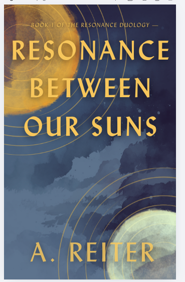
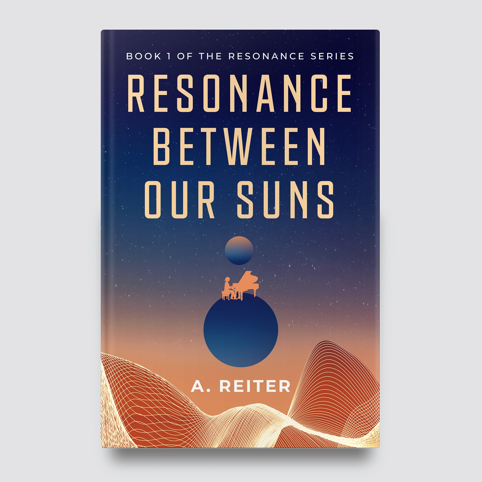
Srdjan helped me create the cover I wanted; one that felt grand on a cosmic scale, and yet mysterious, intimate. My book is the story of one woman, and how she’s trying to find her place in the world through her music; a journey that will take her light years from everything she loves. The final cover shows just that.
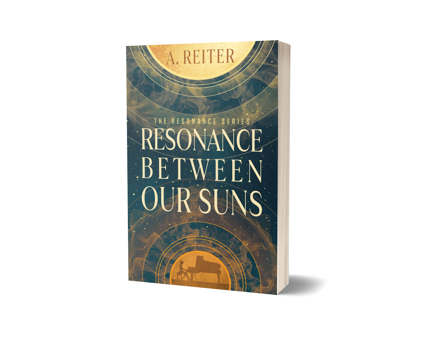
Read an excerpt from my upcoming debut Resonance Between Our Suns here.